
Dashboard that has a LOT to browse/search through:
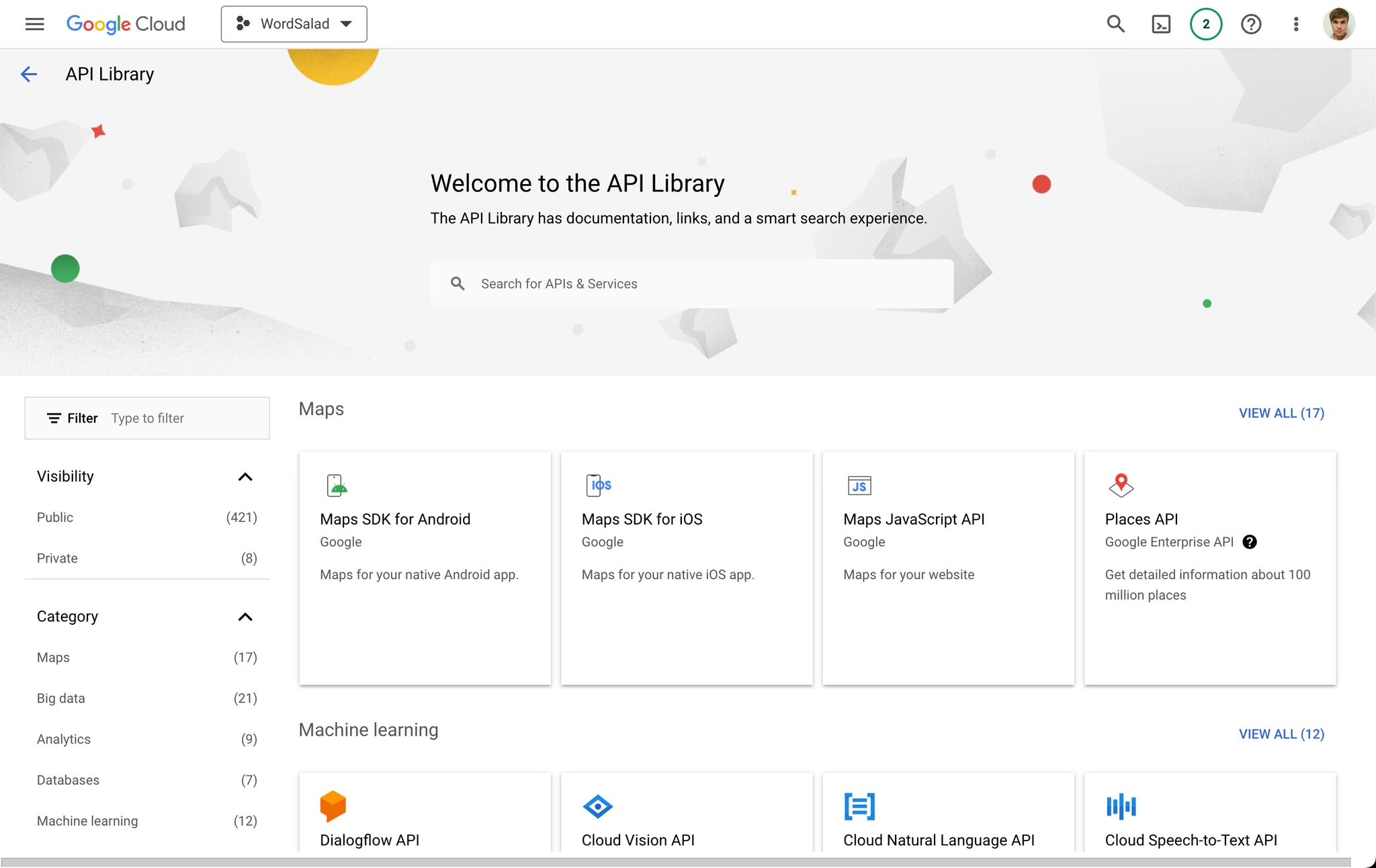

The search box — very nice style matches the logo branding. Compact. Expands when clicked.
It’s noticeable without being distracting. It makes me want to click, but doesn’t coerce me.
The other elements could use refinement, especially header and breadcrumbs text sizes/spacing.
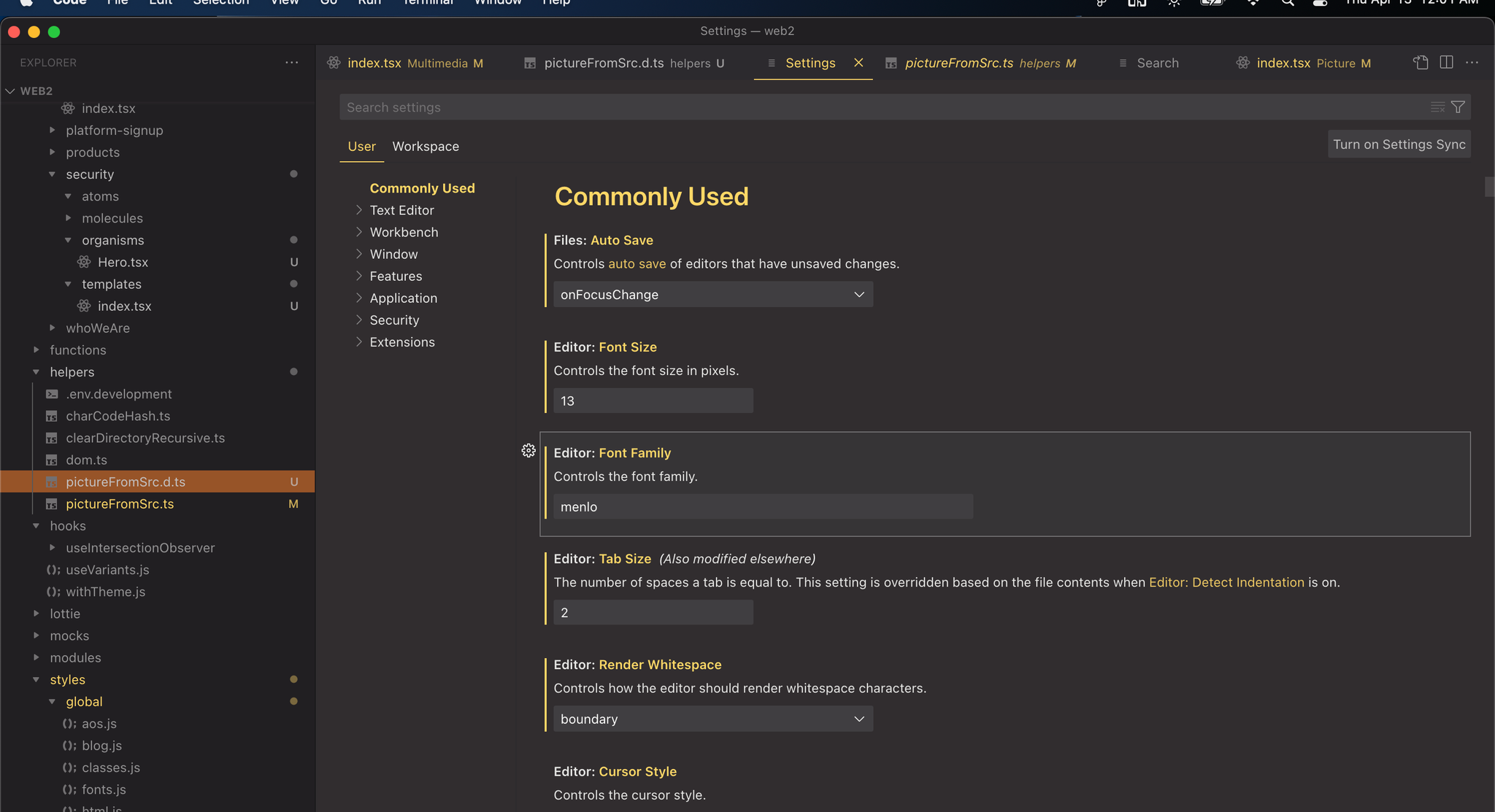


HTML / CSS component library
uiverse.co - Beautiful and practical website/app snippets such as buttons, inputs, cards, loading spinners, etc. No JS. No BS. Just copy/paste the CSS/HTML from each component on this site.
Great YouTube channels
Accessibility
whocanuse.com - helps you create color schemes that are OK for color-blind people
UI UX Resources
gumroad.com/tsolution#XIViN - 99+ design resources
https://absurd.design - absolutely fucking brilliant!
Design Collective: https://uxdesign.cc/
Great posts about UX development and design:
https://uxdesign.cc/search-with-typo-tolerance-2c78abbb96a6
Product Hunt: https://www.producthunt.com/topics/design-tools
ultimate list of resources for product designers
100.exposed - tools and resources
articles and tutorials - read about designing better
removeit.io (remove the background from a portrait photograph - works surprisingly well! - free for low resolution - $2 fee to download full resolution image)
Convert Video → GIF (https://crello.com/tools/gif-converter)
Design Foundations - A Guide to Visual Hierarchy (with Infographic)
The internet has made virtually any information a person could want accessible with just a few keystrokes. But in practice, this has been both a blessing and a curse-so much of the information available is difficult to absorb due to bad design.
https://www.toptal.com/designers/ux/visual-hierarchy-infographic

MICROINTERACTIONS
Framer Tutorial: 7 Simple Microinteractions to Improve Your Prototypes
Welcome to the second installment of our Framer tutorial series. In the last article, we learned about the basics of using Framer in Design mode, as well as how to write some simple code to make our designs come to life. In this piece, we will focus on using Framer to create microinteractions and animated transitions.
https://www.toptal.com/designers/framer-js/microinteractions-in-framer-studio

THE RULE OF THIRDS
ODD THINGS LOOK BETTER
TRIANGLES wahoo!
IconsFontsInspirationIllustrationsWebsite designStock photos & graphicsFigma (shortcuts and tricks)photosUX Resourcesinteraction designColor EducationUX Research Community/NetworkingText Gradients