It’s a lot of work to build from scratch, so here are the best open-source solutions.
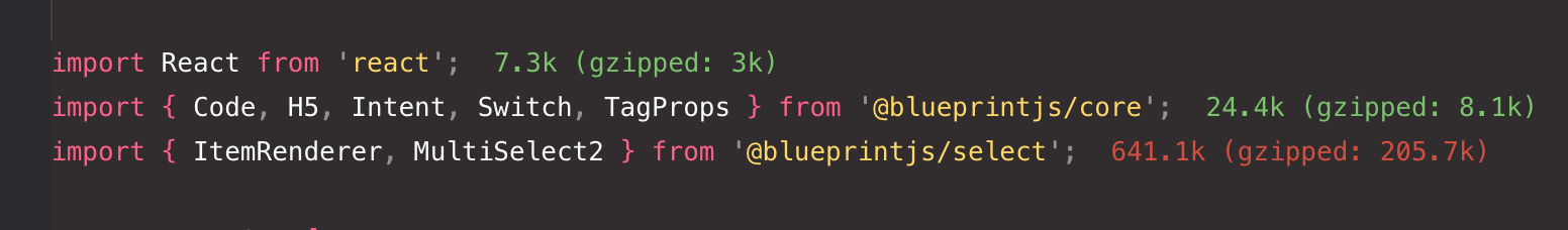
#4 - Blueprint JS
Has an excellent component that looks great and functions very well by default. Works perfectly.
Unfortunately, it’s YUGE! 641kb — I thought AntDesign was heavy, but this is 2.5 times the size!
The core components are not too big however, so they’re maybe worth using.
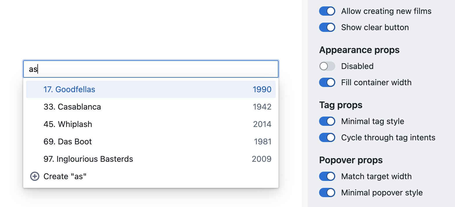
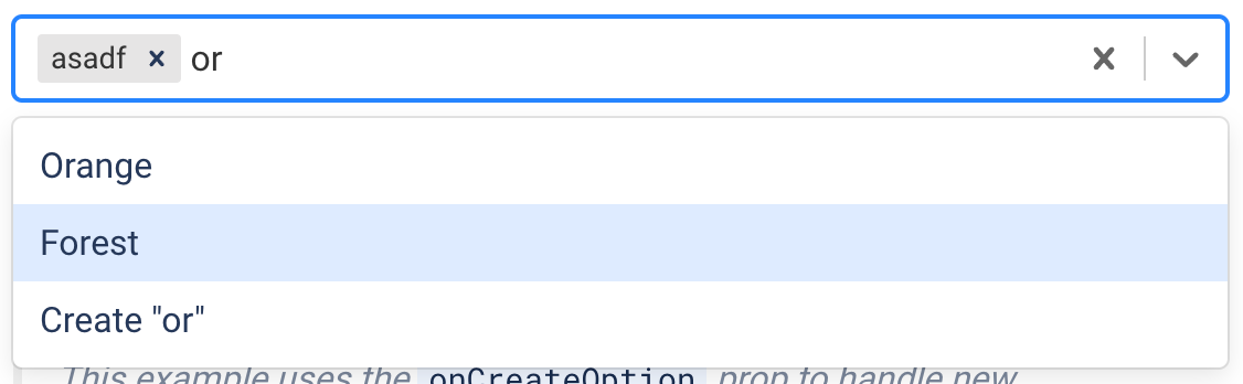
#3 - Ant Design
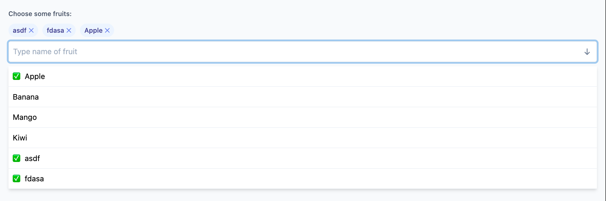
More customizable than BlueprintJS. You can build your own dropdown menu - add titles, labels, tooltips, hierarchy, buttons, whatever!
It’s got a multi-select option, but it’s hard to build, and I didn’t need it yet, so I didn’t bother. In this screenshot example I also didn’t finish styling it before going with a different option.
For a powerful and feature rich component, this size is forgivable. Unfortunately, even the most simple Antd React components are very large (they didn’t optimize for page speed at all).
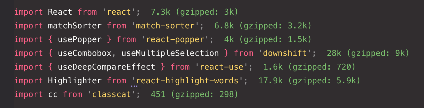
#2 - Downshift
Performant! Efficient! Totally customizable. Headless (example uses TailwindJS, but give it whatever selectors you want and style however you need). Seems to be most accessible too!
Very small package size - even with all these extra utilities which could totally be removed or copied to an in-house utility library.
This really showcases the benefits of moving away from CSS-in-JS. The others bundle styles with JS. But that causes a lot of architectural awkwardness and bloat, making the package huge. This one is newer, written with React hooks, and not styled by default.
#1 - react-select - 🏆 best choice!
Fast, efficient, … and compact! Fits on one line. Downshift unfortunately needs 2 - one for the selected tags, and a second line for the input field.
And so easy to implement! Looks great out of the box. Just tweak a bit of CSS (if necessary).
They even thought about the developer having to customize the style! No more struggling to select some inner element of an NPM package using
input + div > span:nth-child(2). Instead: https://react-select.com/styles#the-styles-prop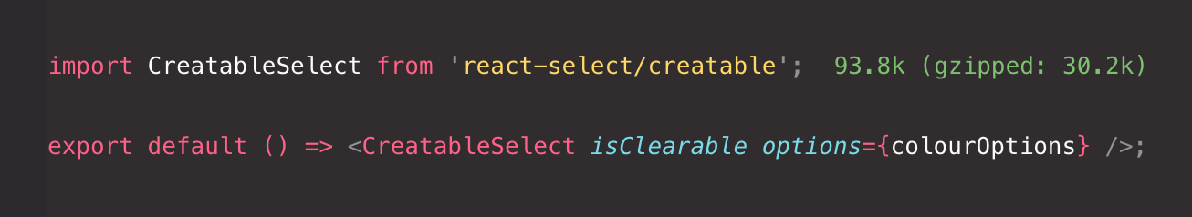
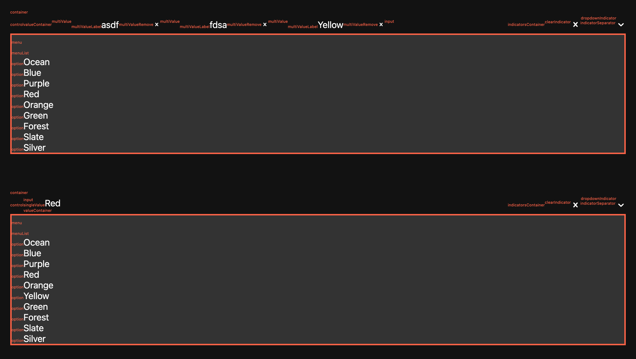
If you use react-select, here is a printout of what all the “Inner components” mean. This is for use with the
styles and classNames props. Tip — pass prop unstyled={true} so their default styles (light-mode) won’t get in the way (with your dark-mode site).