So many great guides out there! This is very easy to read. Typography, spacing, and colors are excellent. The best “dark theme” I’ve seen.
Very well organized and laid out. Also looks like an excellent service! I’m going to sign up.
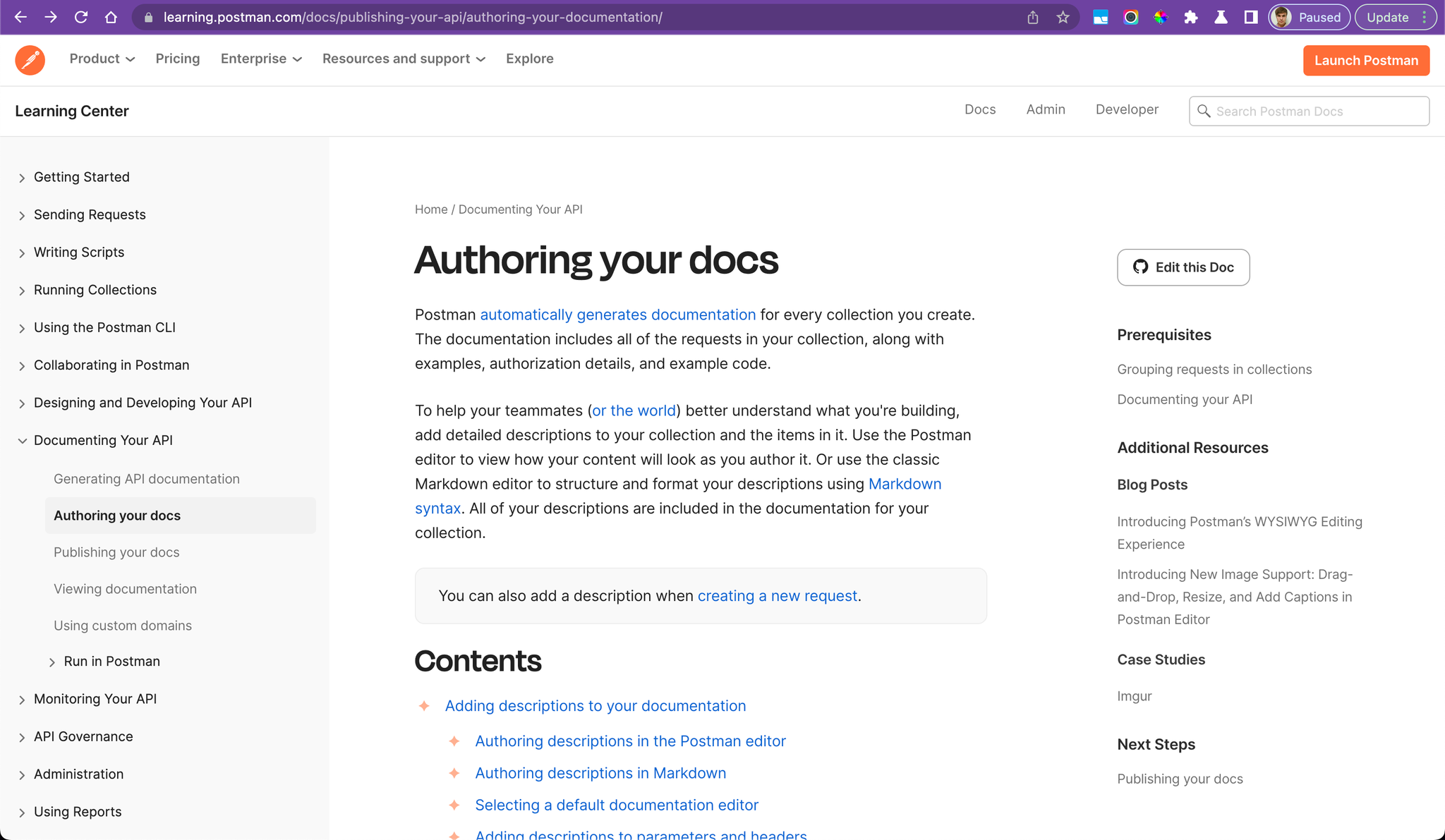
Seems like sites that are in business of providing documentation - have good documentation. Postman is great! Love the 3rd column - it’s not just a list of titles on the page. It’s actually related helpful content.
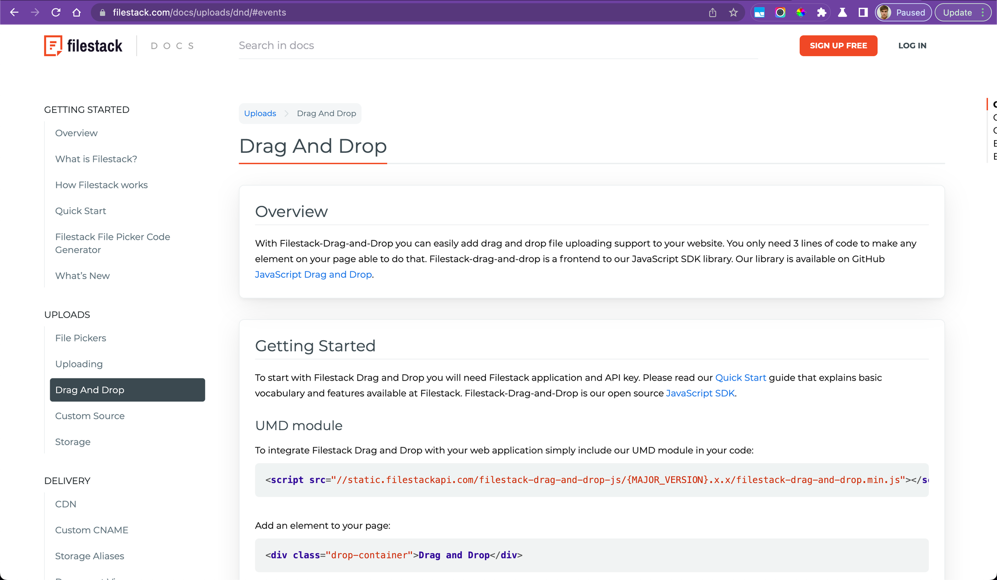
Wonder how they made this? Oh, the button’s right there! Looks like most of these tech companies with great docs are actually building their own solutions from scratch! Bummer. But often, you can copy and change their open-source codebase! Score!
Also this site search is very good! Does’t have the Algolia logo. It shows a matching title and description, which is very very useful, highlighting the search term in both.
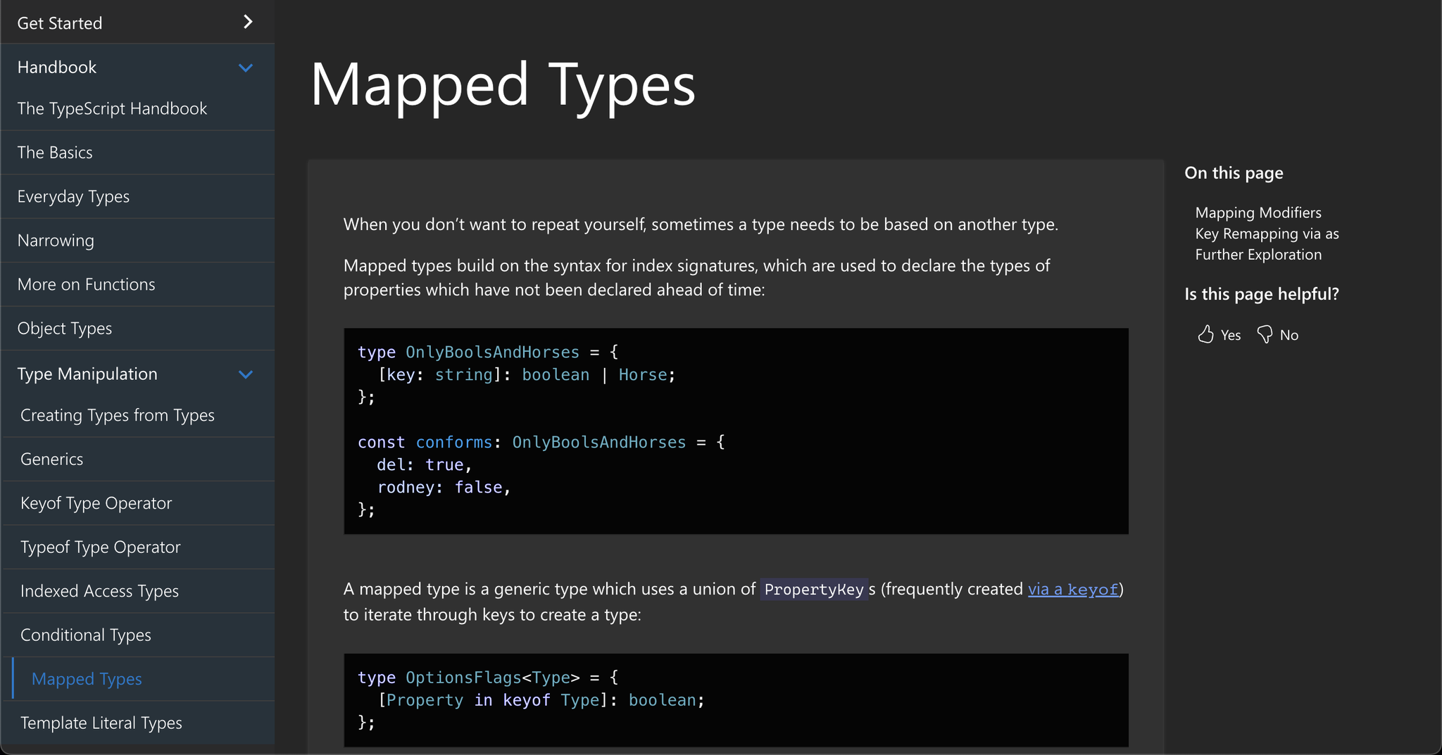
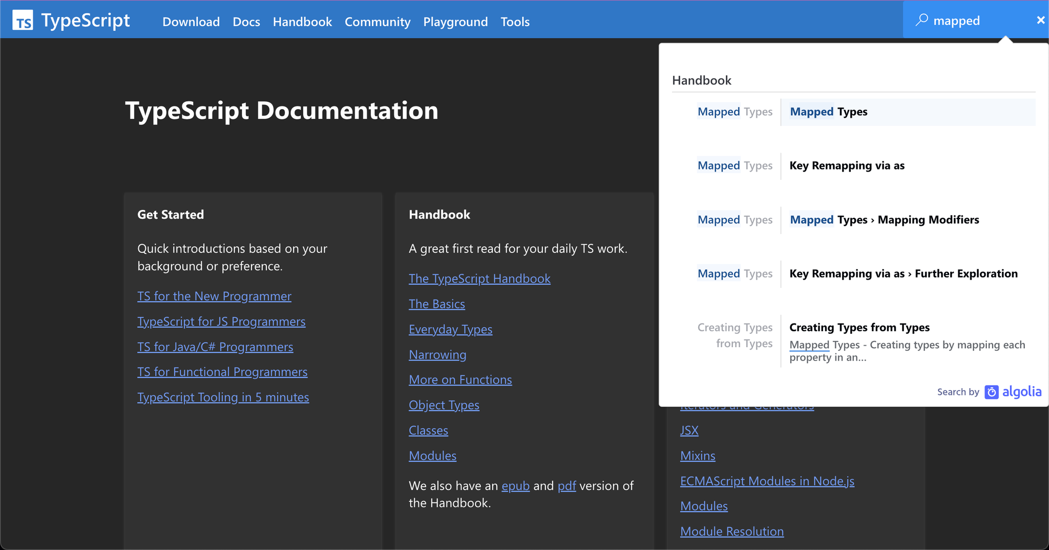
Typescript
Typescript adds a lot of complexity to the classic JavaScript. So I’m glad it has very good documentation. The homepage lists of lists is very powerful and welcoming. Search is very good, not just a flat list but actually gives a bit of context and highlights the search term. And the colors are easy to read.

Another beautiful documentation. Seems most of the newer docs sites are using MDX. For good reason! MDX is best of both worlds: Markdown + HTML + JSX. This one is open source.
Beautiful! Easy to read and navigate. Notice how some pages have 3-columns, and some have 2 columns with an extra wide middle column. I don’t know if that’s on purpose (you can see that the 3rd column in this screenshot is actually all the way on the right, cut off). But I like it. I like being able to make some page content larger, if they need more space, so they’re not cramped. Makes sense when mentioning long lines of code and wide tables with multiple columns.
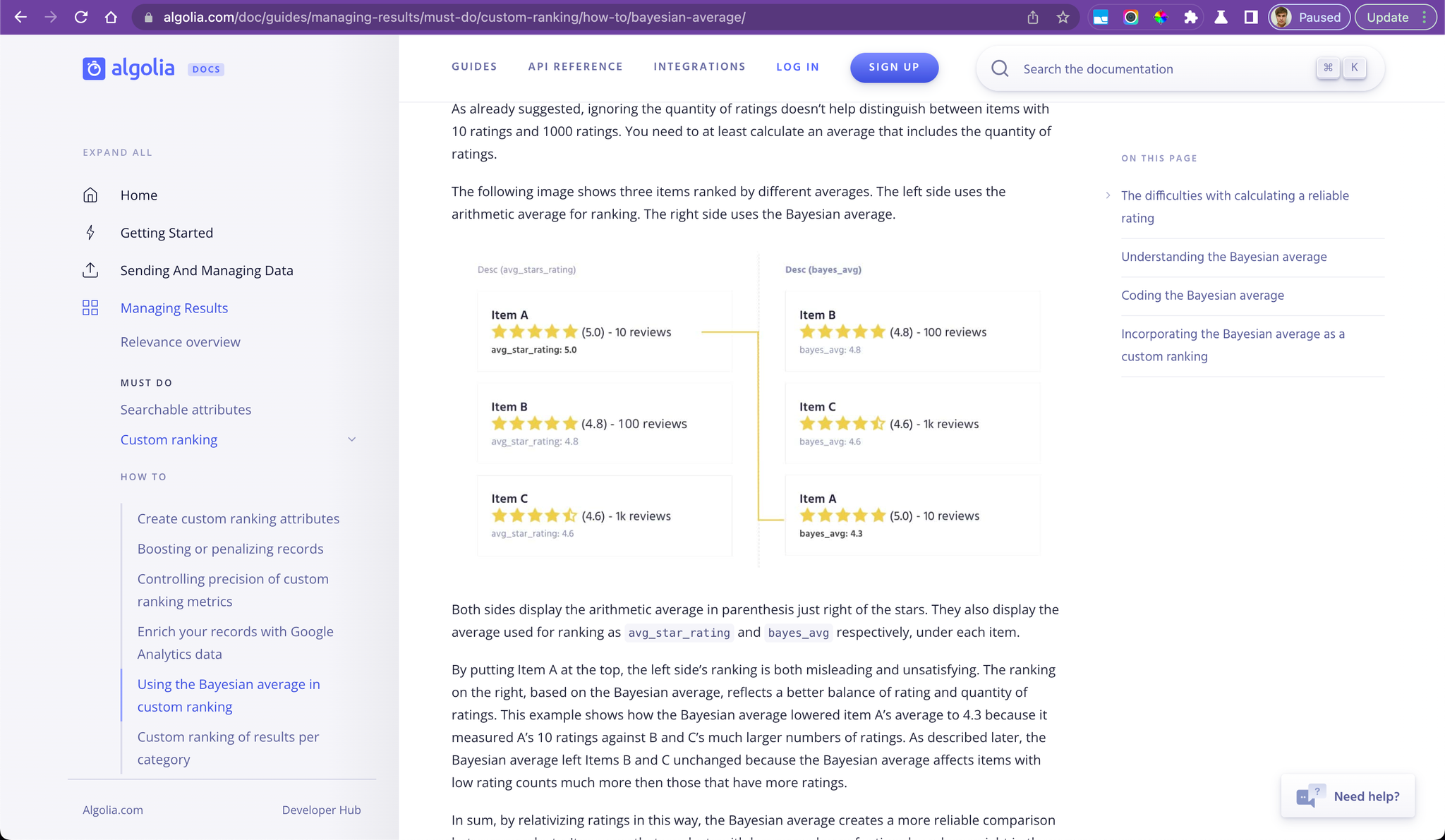
Great site. The columns are narrower than usual with more space to left/right, which makes it easier to read. Wish the text was a bit bigger with less empty space around it. There is a lot of content to organize! And it does a good job grouping the different concepts. Everything is very well thought out. I like the search bar and the popup search results. They are a search company.
Very clean easy to read and use guide. Not intimidating. I like the top left nav.
Using Docusaurus, same as Supabase. Looks like it’s pretty customizable! Wonder just how much we can customize, if the landing page of the documentation can be a totally awesome marketing site like Spiral.us. Then the inner pages can be documentation.
Same as Supabase, but different theme plus breadcrumbs.
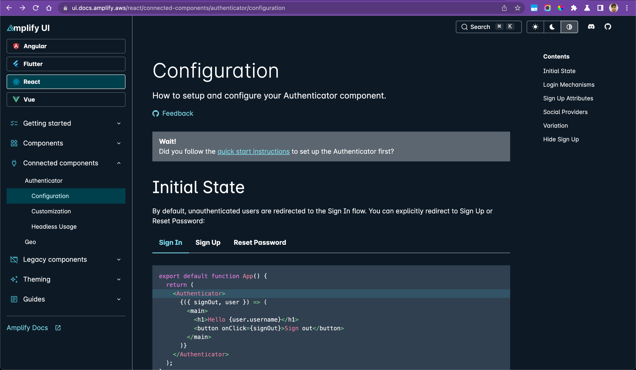
Amplify UI
Customized their left panel with buttons/tabs.
A lot of content! Good layout. This is custom built. They have many employees.
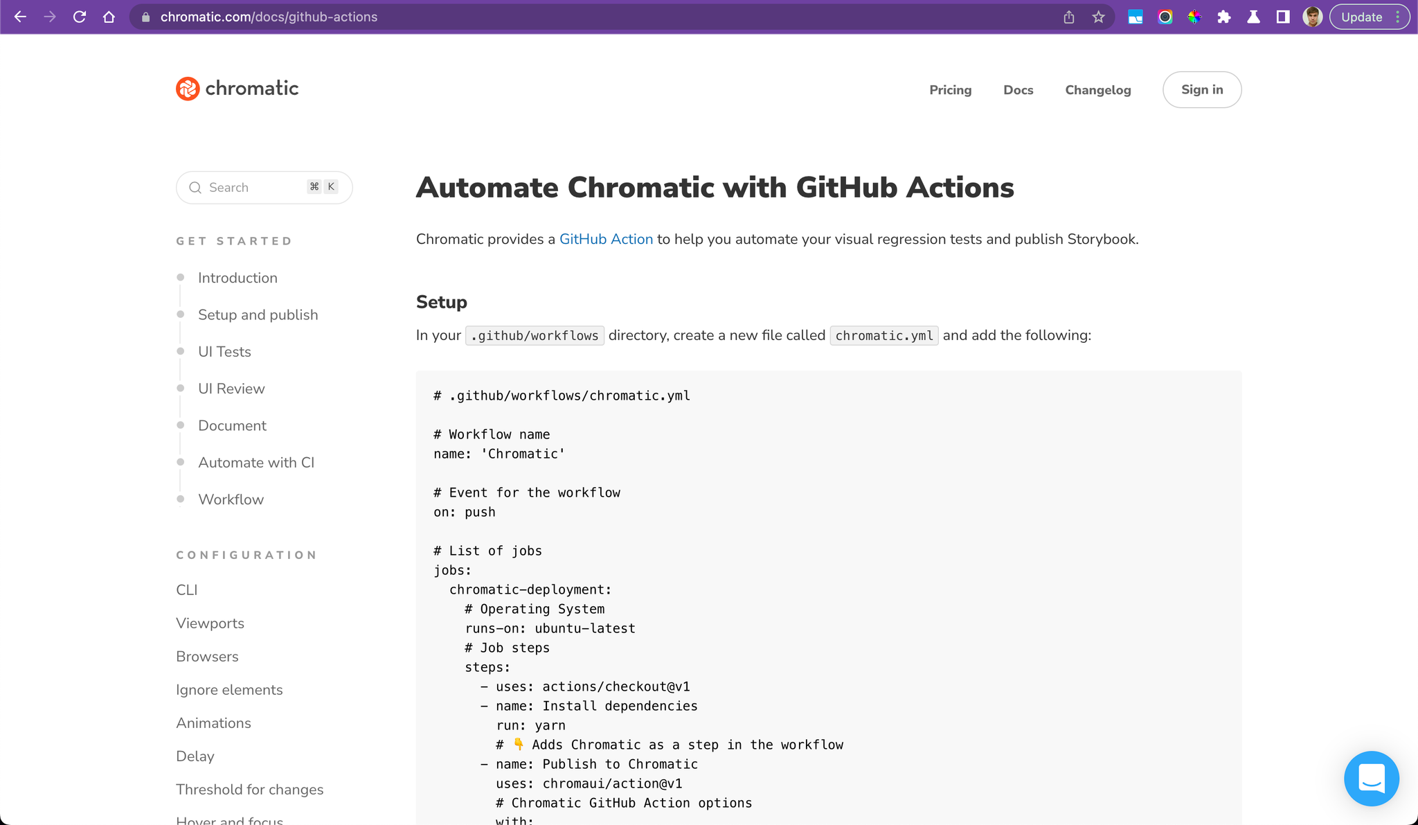
Great documentation that is not a separate site, but part of the marketing website. It makes a lot of sense to build this way whenever possible - 1) for much better SEO, 2) more control over design and marketing, and 3) more conversions because the pricing/signup links are right there.
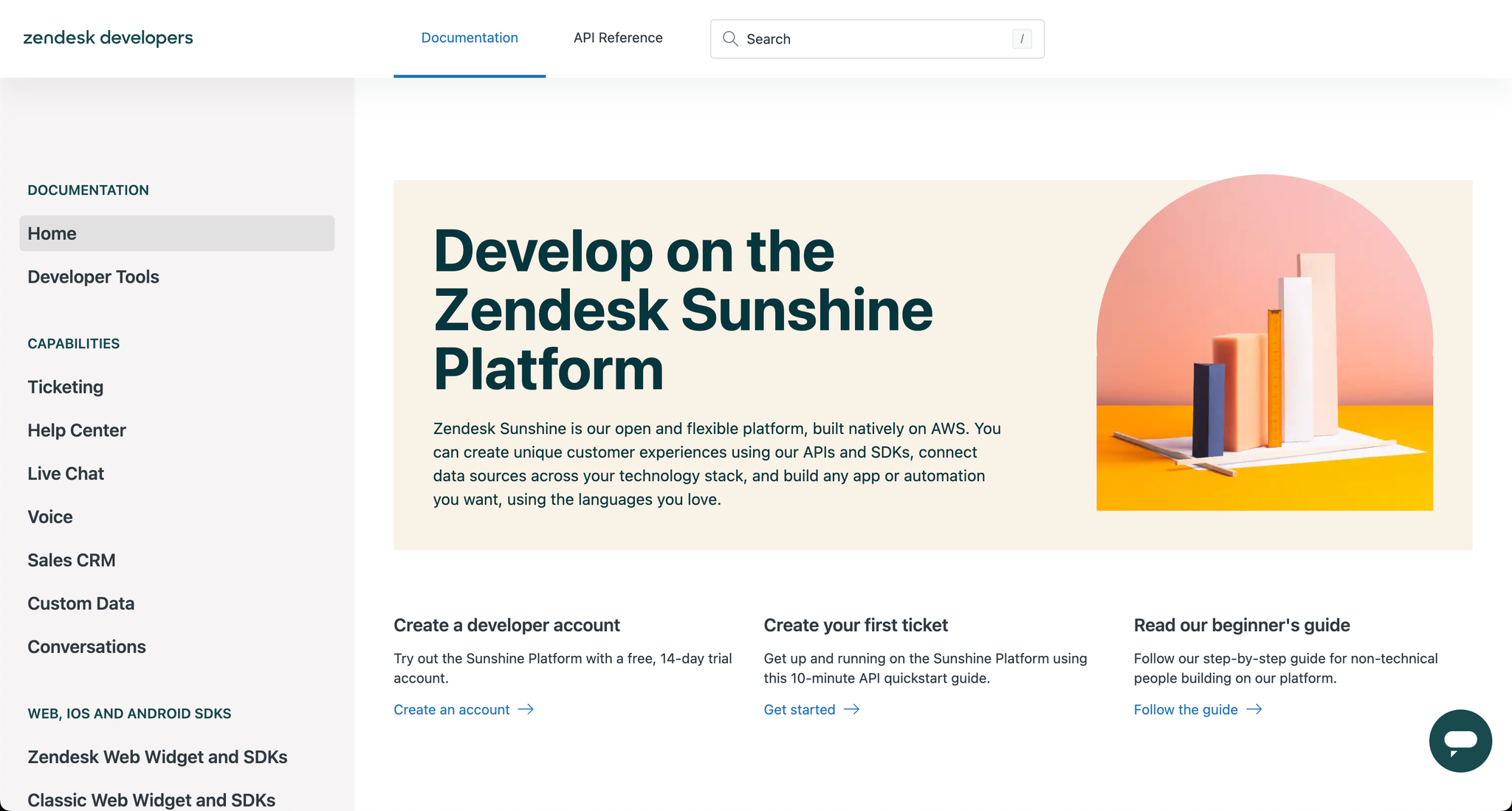
It is “zen”. Beautiful. Comforting, inspiring, and inviting. Feeling matches the company name.
Their “API Reference” is simply another manually written guide, not a full-featured API reference.
If you just ignore their ugly distracting “What’s New” button and “Thumbs up/down” icons, and remove the header… Then it is a nice documentation site that condenses a lot of information into one site.